This article contains affiliate links. As an Amazon Associate, Next Level Mac earns from qualifying purchases.
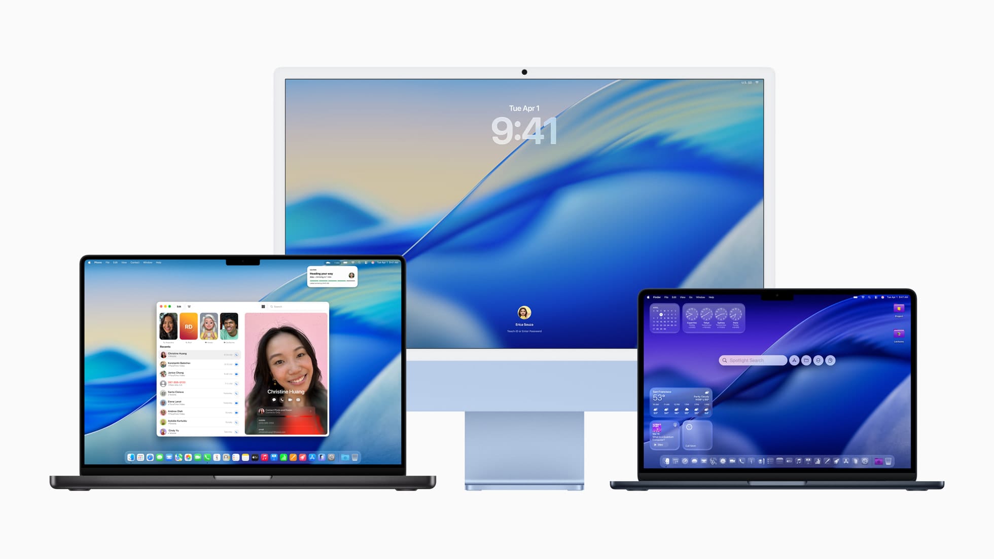
Liquid Glass brings layered translucency and soft blur across toolbars, sidebars, and menus. It looks fresh, but it can reduce contrast in busy scenes. The good news: a few gentle tweaks make it comfortable and clean.
Start with the wallpaper. Photos with uniform color or soft gradients reduce visual noise under translucent UI. Choose a calmer image and avoid high-contrast patterns behind your menu bar.
Open System Settings → Wallpaper, pick a simple still image, and turn off dynamic options if fast shifts are distracting. Consistency here helps every window feel clearer.
Next, tune transparency. System Settings → Accessibility → Display has two key switches: Increase Contrast and Reduce Transparency. Try Reduce Transparency first for a subtle clarity boost without changing the overall style.
If menus still feel low-contrast, toggle Increase Contrast. It strengthens borders and text separation while keeping the general look intact. You can leave the rest of Accessibility settings untouched.
Adjust menu bar legibility. In Control Center → Display (or System Settings → Control Center → Menu Bar), keep the menu bar background enabled so text sits on a more solid base. Avoid bright, busy wallpapers at the very top edge.
Brighten your workspace, not your screen. Adding gentle, indirect desk lighting lowers perceived glare and keeps the UI readable. A monitor light bar focuses light where you need it and avoids reflections.
The BenQ ScreenBar mounts above a display, adds even illumination, and frees desk space. It won’t wash out your screen and pairs well with the translucent UI.
Get the BenQ ScreenBar here (Amazon Affiliate Link: https://www.amazon.com/BenQ-ScreenBar-Auto-Dimming-Adjustment-ScreenBar_Black/dp/B076VNFZJG?tag=nextlevelmac-20
On a MacBook, an anti-glare film can tame reflections without cranking brightness. It softens harsh highlights that make translucent panels harder to read in daylight.
A simple pick is a matte screen protector sized for the 14-inch MacBook Pro. It reduces glare and fingerprints while keeping text crisp enough for menus and sidebars.
Get the Supershieldz Anti-Glare for MacBook Pro 14 here (Amazon Affiliate Link: https://www.amazon.com/Supershieldz-Anti-Glare-Protector-Designed-MacBook/dp/B09JXZ6W94?tag=nextlevelmac-20
Now set comfortable brightness and warmth. In System Settings → Displays, use Night Shift or Schedule warmer color in the evening. Warmer tones reduce eye fatigue and improve perceived contrast against translucent panels.
Fine-tune app chrome. Many apps let you disable sidebar translucency or compact their toolbars. Check each app’s View or Appearance settings and choose “reduce transparency,” “compact,” or “high contrast” if offered.
Customize Control Center. In System Settings → Control Center, pin the items you actually use, and remove the rest. Fewer icons mean faster targets and less visual clutter next to a translucent background.
Spotlight can be styled by context. If the blur behind Spotlight feels busy, try invoking it over a full-screen app or a neutral desktop space. The cleaner backdrop makes results easier to scan.
Dial motion down if animations distract. System Settings → Accessibility → Display → Reduce Motion softens some transitions. It keeps Tahoe’s feel, but minimizes attention-grabbing swoops.
Choose accent and highlight colors with intent. Neutral or darker accents often read better on translucent panels than ultra-light pastels. Try blue, graphite, or slate and see which pops without shouting.
Check menubar utilities. If you rely on lots of icons, consider consolidating with a single all-in-one utility or pin only what you tap daily. Liquid Glass looks its best when the top edge is simple.
Consider pointer clarity. High-precision scrolling helps target smaller, semi-floating buttons and sliders. A good mouse can make the UI feel more “solid” without changing any visuals.
The Logitech MX Master 3S for Mac adds precise tracking and smooth scrolling for long documents and settings panes. It helps navigate translucent toolbars with less overshooting.
Get the Logitech MX Master 3S for Mac here (Amazon Affiliate Link: https://www.amazon.com/Logitech-Wireless-Bluetooth-Ultra-Fast-Scrolling/dp/B09KWXZ1HW?tag=nextlevelmac-20
Give sidebars more breathing room. In apps like Notes, Mail, and Photos, increase the sidebar width slightly. A few extra pixels can keep labels from overlapping background texture.
Use Focus modes to calm the desktop. When deep working, enable a Focus that hides alerts and badges. Fewer red dots behind translucent chrome means fewer attention traps.
Try “reduce transparency” per-app alternatives. Some creative tools offer their own “solid UI” themes or dark modes that pair nicely with Tahoe’s system look. Mix and match by use case.
If you prefer the style but need moments of maximum clarity, use full-screen for writing, coding, or spreadsheets. It temporarily removes busy backgrounds while keeping the system aesthetic.
Keep color profiles honest. In System Settings → Displays → Color Profile, stick with the default for your Mac or calibrated monitor. Over-saturated profiles can make text halos look harsher on translucent layers.
Revisit these tweaks after a day or two. Small changes often add up, and your eyes adapt. The goal isn’t to turn Liquid Glass off—it’s to make it feel clear, consistent, and calm in everyday life.
Finally, remember that comfort includes your space. Good ambient light, a tidy menu bar, and a few sensible settings are usually enough to make Tahoe’s new design both pretty and practical.

Related Posts
Finder Quick Actions in macOS Tahoe Automate File Tasks Instantly
Jan 12, 2026
Master Pixelmator Pro: The Ultimate Mac Photo Editor Guide
Dec 10, 2025
Keka: The Best Mac File Compressor
Dec 10, 2025