This article contains affiliate links. As an Amazon Associate, Next Level Mac earns from qualifying purchases.
iOS 26 adds a simple color-matching trick that ties the Home Screen to the color of an Apple MagSafe case. The result is a coordinated look that feels designed, not random.
The feature reads a tiny NFC tag inside official Apple cases to learn the exact color variant. That color becomes the base for a system-wide icon tint that stays readable in both Light and Dark modes.
Before starting, note the hardware requirement. Case-matching needs an official Apple MagSafe case that includes the color tag.
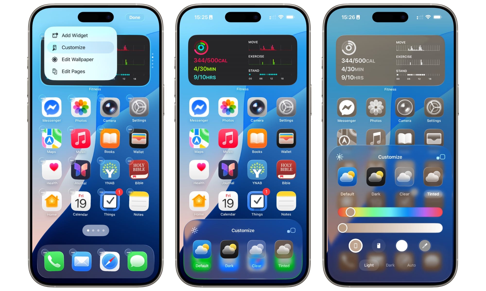
To turn it on, long-press an empty area on the Home Screen until icons jiggle, then select Edit → Customize. Choose Tinted, then tap the case icon in the color row.
Pick Light, Dark, or Auto to suit the environment. Auto will track system appearance and keep the tint balanced day and night.
Expect a softer, more unified aesthetic compared to default multicolor app icons. Tinted mode keeps glyphs legible while removing the visual noise of dozens of clashing hues.
No Apple case? A second option in the same panel matches icons to the iPhone’s body color. It isn’t as precise as the case method but achieves a similar vibe.
For a quiet look, try a low-saturation tint like stone, midnight, or soft blue. Minimal color plus simple widgets creates an easy-to-scan Home Screen.
Prefer a bolder style? Choose a saturated tone that echoes the case, then use a low-detail wallpaper to prevent visual competition. Solid or gradient wallpapers work best.
Widgets inherit the tint as well, which keeps them consistent with icons. A few well-chosen widgets are better than many small ones.
Legibility matters more than novelty. If icons blend together too much, bump saturation slightly and choose Light mode for clearer shapes.
Focus modes can amplify the effect. Assign a different case or tint preset to specific Focus states to separate work and personal screens.
App Library remains unaffected beyond the general tint look. The search behavior is unchanged, so navigation stays familiar.
For those who like seasonal varieties, this feature pairs well with a small case collection. Swap a case, tweak the tint, and the phone feels fresh without a full redesign.
When changing cases, the color update appears after a brief moment on the Home Screen. If it doesn’t, re-enter Customize and toggle the Tinted option once.
Wallpapers still do a lot of heavy lifting. Monochrome or subtle texture backgrounds let the tint read cleanly, while busy photos can muddy the palette.
Icon glyphs remain white in Light mode and near-white in Dark mode. That fixed contrast helps accessibility and keeps the aesthetic coherent.
If certain third-party icons feel indistinguishable, place them in labeled folders or pin them to a widget stack. Structure offsets similarity in color.
The case-matching tint is optional and reversible. Switching back to standard icons is one tap away in the Customize panel.
A note on clear cases: a clear case plus the device-color tint can create a glassy, modern look. It’s a strong choice for those who enjoy the natural device color.
For durability and grip, Apple’s Silicone Case for iPhone 17 Pro remains a straightforward match. The finish pairs naturally with the system tint and keeps buttons responsive.
Get the Apple iPhone 17 Pro Silicone Case with MagSafe here (Amazon Affiliate Link: https://www.amazon.com/Apple-iPhone-Silicone-Case-MagSafe/dp/B0FQG1K79L?tag=nextlevelmac-20
For texture and a woven fabric feel, Apple’s TechWoven Case for iPhone 17 Pro coordinates directly with the color-matching feature. The tactile sides offer a little extra security in hand.
Get the Apple iPhone 17 Pro TechWoven Case with MagSafe here (Amazon Affiliate Link: https://www.amazon.com/Apple-iPhone-TechWoven-Case-MagSafe/dp/B0FQF5G996?tag=nextlevelmac-20
Prefer a clear, protective option that still plays nicely with tints and MagSafe? Spigen’s Ultra Hybrid MagFit for iPhone 17 Pro keeps the device color visible and resists yellowing.
Get the Spigen Ultra Hybrid MagFit Case for iPhone 17 Pro here (Amazon Affiliate Link: https://www.amazon.com/Spigen-Covered-Control-Anti-Yellowing-Compatible/dp/B0FD21G2ZX?tag=nextlevelmac-20
To keep the style consistent across pages, repeat the same widgets and folder names. Consistency helps the tint read as a deliberate design choice.
Icon spacing also influences the effect. A single page with larger widgets often showcases the color story better than multiple cramped pages.
For productivity layouts, try a two-row icon grid under a medium calendar and reminders widget. The tint becomes a unifying backdrop rather than a distraction.
Photography and media pages can go with richer tones. Music and Photos widgets look striking against a high-contrast tinted background.
Travel layouts benefit from calmer mid-tones for quick scanning. Maps, Wallet, and airline apps remain obvious at a glance.
If a favorite wallpaper clashes, convert it to grayscale in Photos first. Grayscale images respect the tint without fighting it.
Those who switch cases often may want to save a few wallpaper presets. A matching wallpaper for each case speeds up the swap.
Remember that lock screen customization is separate. Lock screen colors won’t auto-match the case unless set manually, so choose complementary tones there.
The same goes for StandBy mode. Pick a background that complements the Home Screen tint to keep the desk or nightstand view cohesive.
For accessibility, increase text size slightly if the new palette reduces perceived contrast. The icon glyphs stay bright, but larger labels can help.
In Dock, darker shades often look cleaner. If the Dock appears too intense, lower the saturation slider a notch.
Don’t forget app icon alternatives offered by some developers. Even with tinting, a distinctive alternative icon can reduce confusion in dense grids.
Shortcuts can add a quick toggle to jump between Tinted and Standard. Place it in the Control Center for fast changes.
The case-matching tint won’t impact battery life in any meaningful way. It’s a visual layer, not a live process running in the background.
On privacy, the case’s color tag isn’t personally identifying. It’s a one-way hint for style, not a tracker or sensor.
If the tint ever looks off after a system update, revisit Customize and reselect the case option. Minor resets can clear cached values.
Those who use a leather or third-party case without the color tag can still build a strong look. Use the device-color or manual color picker and keep the rest of the layout minimal.
For households sharing a color theme, Focus filters can align calendars and widgets per person. The theme remains consistent while content stays personal.
As iOS evolves, expect more color-aware widgets and icon sets. The current version already demonstrates how small touches can make the phone feel styled.
The takeaway is simple. A case and a couple of taps transform the Home Screen into something coordinated, personal, and easy to navigate.
When the look is dialed in, save a quick screen recording of the steps for future reference. A short clip makes re-creating the setup fast if a reset ever happens.
A final tip for photos on the Home Screen: favor clean compositions and light subjects. The tint will do the color work; the image just needs to stay supportive.
With iOS 26’s case-matching tint, style and function meet in a small but satisfying way. It’s a five-minute upgrade that makes the phone feel tailor-made.

Related Posts
iPhone 17 Screen Protectors: Why Anti-Reflective Coating Matters
Dec 06, 2025
Master iPhone Automation: The Ultimate NFC Tag Guide (2026)
Dec 05, 2025
Free Up Your iPhone Storage in IOS 26
Dec 05, 2025